Yinibini Baby
Client
Yinibini Baby
Role
UX Researcher
UI Designer
Interaction Designer
Platform
Desktop / Mobile
Duration
3 weeks

OVERVIEW
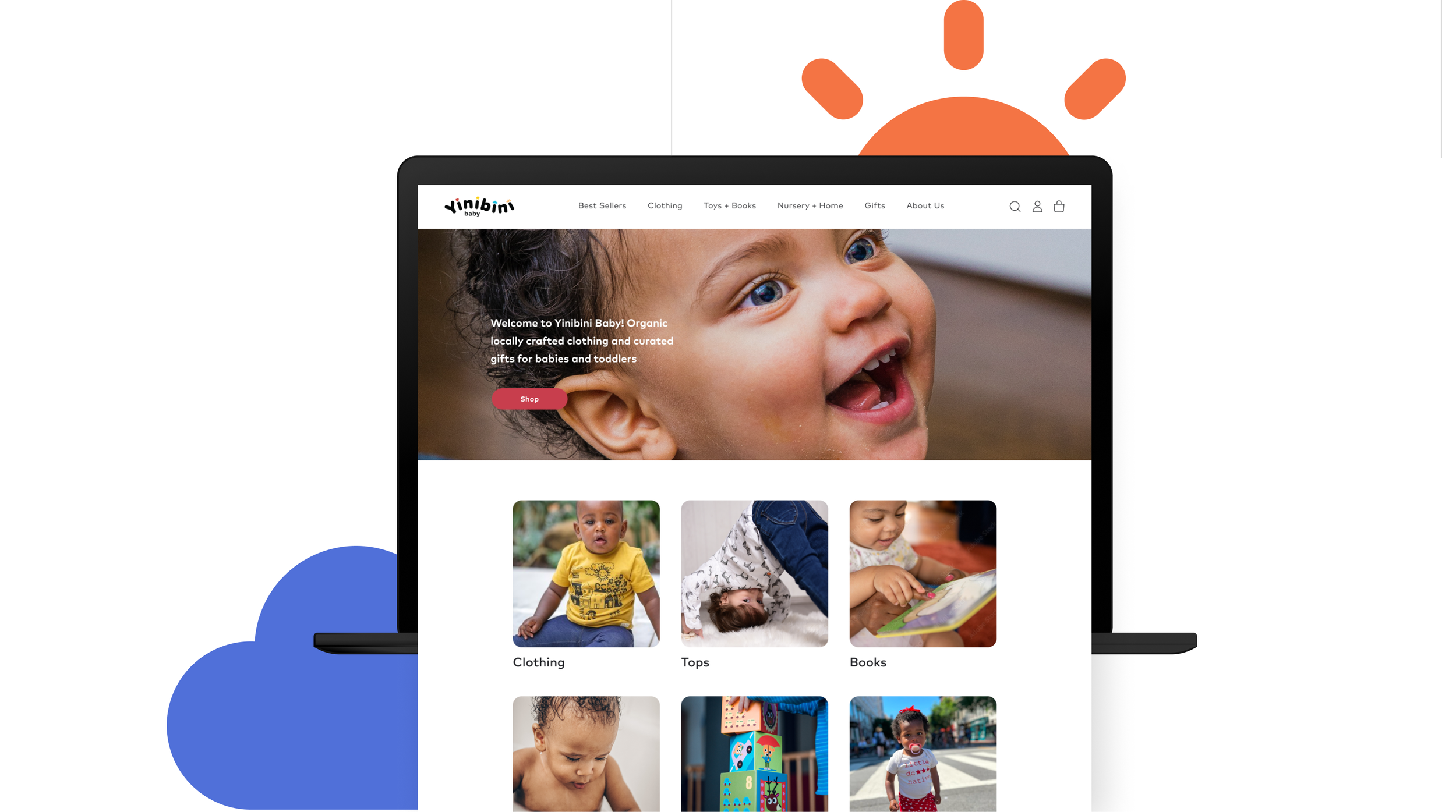
Yinibini Baby is a local business owned by a black entrepreneur in Washington, DC., cherished by its community for its cute baby products and exceptional customer service. Now, the business plans to expand its online presence and provide the same quality service to a wider audience.
To establish themselves in the baby e-commerce marketplace, Yinibini Baby has hired me as a UX designer. My role is to enhance the desktop experience, making it seamless and enjoyable while capturing the unique local charm of their business. To achieve this goal, I have used the double-diamond method of the design thinking process during my research.

RESEARCH AND ANALYSIS
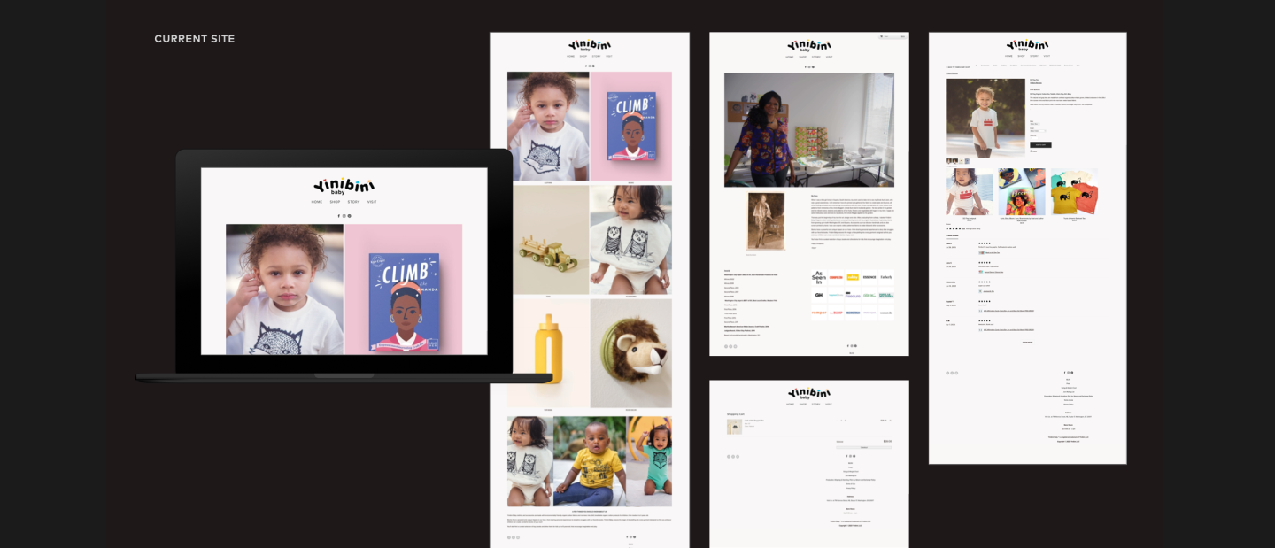
What defines a successful e-commerce site? To uncover the answer, I conducted contextual inquiries about online shopping and usability tests on the site. Then, analyzed the site structure using the Nielsen Norman Heuristic principles to ensure it met industry standards. Additionally, I performed an in-depth comparative and competitive analysis of leading organic baby sites and e-commerce giants such as Amazon, Gap, and Target.
The feature analysis revealed that Yinibini Baby lacks the essential features of its competitors.
KEY AREAS OF FOCUS
The insights identified four areas for improvement: visual branding, navigation, product information, and customer service.
Visual Branding
Strong brand values and offering high-quality products or services can significantly enhance customer loyalty.
→ High-quality images
→ Brand recognition
→ Strong brand visual and tone
→ Strong community presence
→ Prominent reviews
Navigation
A well-organized layout and clearly categorized menus help customers navigate to their desired destination with ease.
→ Search bar
→ Sorting dropdown
→ Top main navigation bar
→ Filtering sidebar
→ Breadcrumbs
Detailed Product Information
A detailed and well-organized presentation of information helps users make informed purchasing decisions.
→ Size and color block indicators
→ Typography and color hierarchy
→ Shipping information visually displayed
→ Multi-view images and zoom options
Customer Service
Guidance and feedback offer a sense of security and help prevent customers from making mistakes.
→ Help chat bot
→ Shopping bag indicator
→ Checkout process indicator
→ Confirmation messages
PERSONA AND PROBLEM STATEMENT
Meet Cindy, a busy working parent who needs a seamless shopping experience to quickly find products so she can get back to her family and have some alone time from her hectic schedule.
USER KEY INTERVIEW INSIGHTS
Users search by categories on the navigation menu and search bar
Users want a clear, simple layout to help with navigating through the site
Users need product details, including images and reviews, to inform purchases
How might we organize products so Cindy can find them quickly to save time?
How might we present detailed product information to encourage Cindy to purchase?
How might we provide Cindy with a visually appealing website for a delightful shopping experience?
SOLUTIONS
FILTERING
Add filtering and sorting to help users filter down to a specific product
NAVIGATION BAR
Restructure the navigation to include shop categories
SEARCH BAR
Add a search bar for users to find products quickly
SHOPPING BAG INDICATOR
Add a shopping bag icon and indicator to inform users of their selected purchases
VISUAL DESIGN
Establish a design system to create organized layouts with products
Considering Cindy’s needs, I came up with solutions to enhance the navigation and make it easier for users to search for products by utilizing shop categories. First, I analyzed the existing information architecture and carried out card sorting to restructure the products more effectively. Then, I created rough sketches, which were used to produce a mid-fidelity prototype. The prototype was then put to the test to assess the proposed solutions.
SITE ARCHITECTURE AND WIREFRAMES

USABILITY TEST RESULTS
The study involved conducting user interviews with five participants through Zoom to collect both quantitative and qualitative data on their experience purchasing booties in 5 mins.
TASK
You’re attending your niece’s first birthday this weekend and plan to buy booties since she recently started walking. Please visit Yinibinibaby.com and let me know how you would proceed.
REVISED DESIGNS
Users completed the task successfully, but took unexpected search paths due to confusion about the location of the booties. They used alternative methods such as search bar and filters. The task was relatively easy as there were not many products to search through. Here are some recommendations for improving the user experience:
Where are those booties?
The users were unable to locate the booties in the designated category. As a result, they searched by clicking on all categories, returning to the shop page, and filtering the results.
RECOMMENDATION
• Consolidate to one global nav
• Add a dropdown with subcategories
• Add age and price to filtering
When will I get those booties?
Users found the size chart, exposed sizes, organic material, and zoomable images useful, but they wanted to see the shipping cost information to help make a purchase decision.
RECOMMENDATION
• Add shipping options
• Add payment options
Did I get the right booties?
Users found the checkout process easy to use and appreciated the ability to double-check their purchases. However, they were unsure of the next steps after filling out the contact section.
RECOMMENDATION
• Add numbers to indicate the user’s progress
• Make the other process tiles in default mode
PREFERENCE TESTS
Due to the lack of a brand visual system, preference tests were carried out on the homepage layout and color palette to enhance visual design, ensure positive user perception, and convey brand values.
Color Palette
Two distinctive palettes were tested, but most users selected palette A for its bright, cheerful, kid-friendly outlook.
Homepage Layout
Two layouts were tested for navigation and carousel design. Layout A was preferred for its cleaner, more intuitive design, with the search bar on the right and the logo on the far left.
DESIGN SYSTEM
I opted for a clean and straightforward design system to showcase Yninibini Baby's vibrant and lively designs, influenced by Ghanaian prints and the love for Washington, DC. I used a playful primary color palette to complement and guide the user, ensuring the products stand out.
Typography
I chose Mark as the system typeface, a geometric sans with varied weights, for its versatility and roundness complementing the Yinibini baby logo’s playfulness yet structured look.
Color Palette
The color palette is a refined version of the primary color scheme that evokes energetic, bright vibes and speaks to children’s development.
Shoppable
By implementing a search bar, filtering system, and consolidated global navigation with shop categories, users can find products faster and easier.
Enjoyable
Consistent brand visuals, a clear hierarchy of information, and high-quality images engage users with Yinibini Baby's unique products.
Accessible
By increasing contrast and providing proper guidance in compliance with accessibility standards enhance user experience and instill confidence.
LEARNINGS
Shopping is first priority. Users prioritize shopping over other activities like finding the store location, sharing, and learning about the business.
Importance of visual design. Users rely on a clean layout and strong images, which are crucial in building brand trust and creating an enjoyable user experience.
Support a local store. Users perceived the website as a "mom-and-pop" shop with a limited inventory. While the experience was not unpleasant, they felt the store could benefit from tidying up. Nevertheless, they found the products charming and wanted to support small businesses.

NEXT STEPS
Conduct another usability test
Card sorting for product categories
Extend to mobile design
Clean up content and visual
Increase online visits and sales
Decrease the misclicked rate
Decrease the bounce rate
Next Project


